Calenton
Brand Strategy | Visual Identity | Packaging
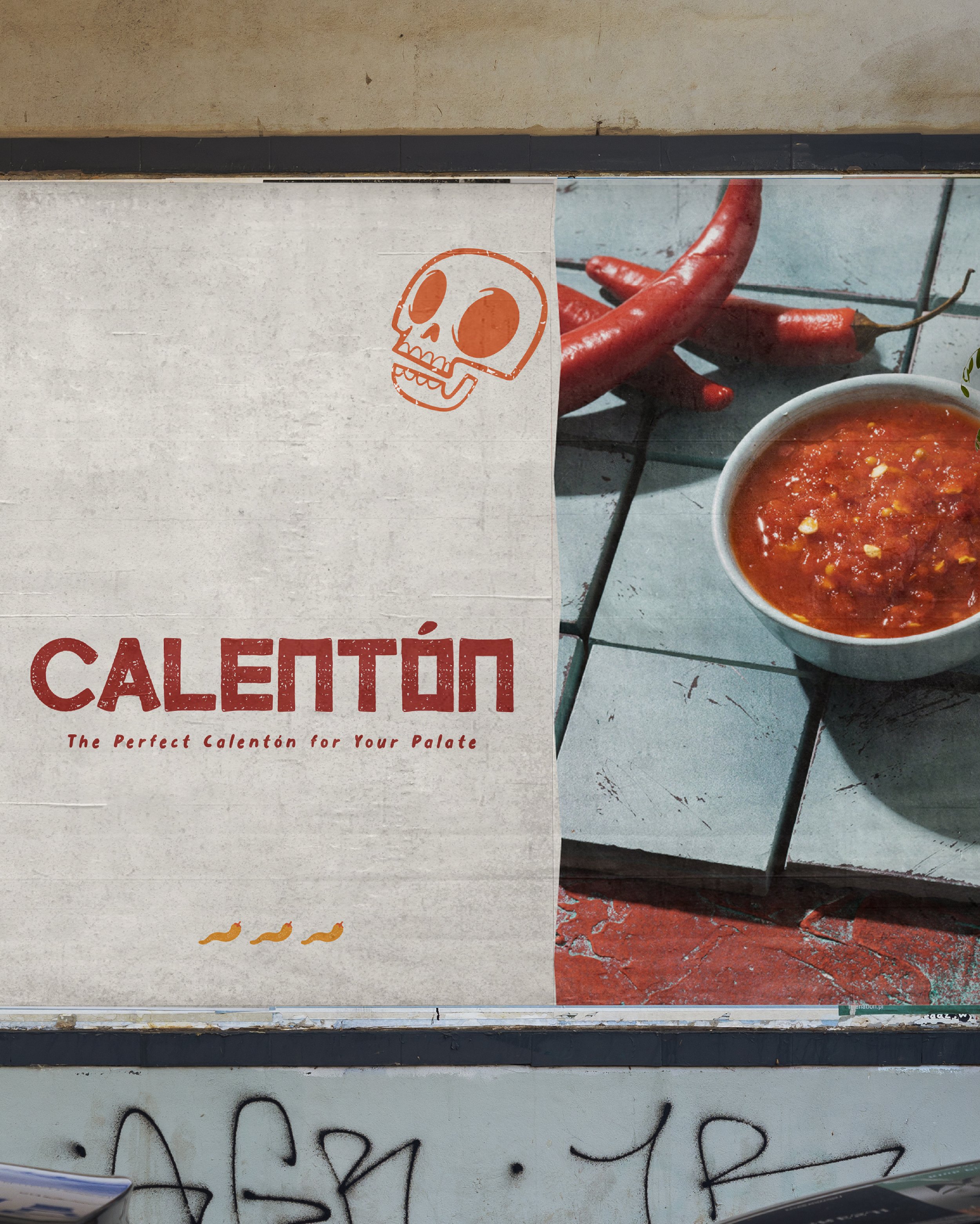
Calentón is a hot sauce brand that brings the heat straight to your table with a fiery selection of bold and flavour-packed sauces. From smoky classics to intense, spice-infused creations, they cater to all heat lovers, ensuring there’s a perfect kick for every palate. Their passionate and daring approach to flavour is reflected in every drop, igniting taste buds with an unforgettable burst of spice. With a commitment to quality and excitement, Calentón is redefining the way people experience heat—turning every meal into a fiery adventure.
Project Goal: Develop a dynamic and striking visual identity for Calentón that embodies its bold and fearless personality. Create a brand strategy that sets it apart from competitors by crafting a design that is intense, energetic, and irresistibly captivating while staying true to its essence.